It has been a long semester, but at last, the end is here. I hadn’t expected quite so much work that would be involved in gathering materials together and creating a personal brand through which we take our first steps out from student life, into the world of industry employment.
In addition to the physical requirements for the end of year show, I have created a folder of assets to prepare for interviews, and to plug my skills and talents on platforms such as social media, and at networking events. It eclipses a similar task from second year – However, this time we had the added requirement of creating business cards for distribution and the challenge of arranging for our degree show display.
Prior to beginning these tasks, I decided to narrow down my personal branding so that each piece that I created has continuity, and can be easily identified in relation to myself. Within the past year, I have been using a logo that is in the shape of a crescent moon – with a star dangling from one of the edges as if on a fishing line. Whilst I loved the concept at the time, it feels a bit too impersonal and ‘blah’. I felt that it struggled to communicate ‘me’ – so rather than accept the design and use it for my materials, I decided to revisit the logo and brainstorm some concepts of how to improve.
Below is an image of the opening shot from my showreel, featuring the revised logo. I have made the shape chunkier and included the additional decal of a rose within the shape to represent my name. I feel that this is a more appropriate choice for me, my particular type of artistic technique prefers inclusion of detail rather than the stripped, minimalistic style.
Showreel 2017

My showreel was created as an opportunity to demonstrate my 3D generalist skills, in addition to my specialisation in layout, illustration and comics. The medium is not entirely appropriate given that the majority of my work is illustrative and two-dimensional, but that was compensated by camera movements that enabled flat paintings to be given a sense of movement through effects such as kens blur and panning.
Figure 1.3 – Shown above, my showreel for the degree show presentations.
Portfolio Booklet
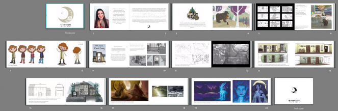


Figure 1.4 – Shown above, the layout for the portfolio booklet that I have ordered in preparation for the end of year show.
In addition to the showreel, the decision was made to combine my work into a 4×6 soft leather portfolio to place on the desk for the duration of the show, allowing visitors to browse through my work and receive some context to the images that are on my board. Unfortunately, the booklet itself will not be ready before Thursday 1st June at the earliest, so I have taken the liberty of printing out two A3 images with the sequence layout of the book.
Business Cards


Figure 1.5 – Shown above, the finalised design for my business cards.
The business cards were perhaps the most challenging element of show preparation, as I had struggled for weeks to create an interesting design that communicated my aesthetic, without being over dramatic. After a range of different rough designs, I finally settled on the style shown in figure 1.5. I elected to use portrait rather than landscape for my card. At this current moment in time, I believe that I am the only one in the class to do so.
The style itself is contradictory – the back side is very busy with the illustration of Luna, my celestial character, in her royal gown. The front side is by contract pure white, with a minuscule use of gold to tie the two sides of the card together. I had used the business cards from last year as a reference during the design process – identifying elements which I liked and disliked about each card. The use of gold was intended originally to be created in gold foil. However, the logistics of implementing that within such a complex design would take too much time, as I required them for the 19th of May.


Figure 1.6 – Shown above, the sketched designs that I had in mind for the business card before settling for the finalised concept.
CV

Originally the CV that I had prepared for this module consisted of two pages and contained slightly more detailed information than the one displayed in figure 1.7 – it had been prepared after conducting research into successful CV layouts and information (the notes of which may be found in my green notebook). However, the team decided that we should have size A4 plastic displays to contain our documents, which would then sit out on the table for the duration of the show. In result of that, I was required to reformat my own so that it could all fit on the one page.
Unlike my teammates, I felt uncomfortable trying to assess my experience using software. I did not wish to claim that I had four out of five-star proficiency in Photoshop, for example, only to be hired and realise that I knew less than first thought. Instead, it seemed like an appropriate choice to list how long that I have been using the software – that way, employers who are familiar with the packages may have an easier time gauging my experience.
Cover Letter
The cover letter was the most difficult writing task, as they are often addressed specifically to one company rather than applying to universal establishments. I decided to write the cover letter as if I were approaching a fictional company with the hope that they may have employment vacancies available, and demonstrate why I believe that I would be a great contribution to their company workforce – especially within a comic pipeline.
Website


Figure 1.9 – A comparison between my website from second year (left) to the one I designed recently (right).
I gained a lot of insight since the last time that I had to design a website, and I feel that my tastes have matured from that period in time also. The previous website was very dark, gloomy and, in my personal opinion, gave a rather masculine impression. Now with my current website (right), I elected to include the bare minimum of text and remove any other unnecessary features. The grey is clean but not as aggressive for visual stress, and the black text works in context with the tonal headshot. I feel that the website is now more welcoming and less aggressive towards the visitor – especially with the improved navigation and spaced interface.
End of Year Show Presentation


Figure 2.0 – Shown above, fundraising events that we held in order to raise the money for much-needed essentials for the show.
To prepare for the end of year show, the degree show committee decided that it would be best to try and run some fundraising events to gather income to source boards (this was prior to us discovering that the tutors simply had to go to the department and request them for the class), as well as additional supplies such as paint and cleaning supplies to spruce up the room.


Figure 2.0 – Shown above, the tickets for the screening of ‘Guardians of the Galaxy’ that I created as proof that someone had spent the money to come to the event.
The event of a book and bun sale was first suggested by Charlie Maxwell. That concept then developed to a screening of Guardians of the Galaxy in the Conor Lecture Theatre, the day before the release of the sequel. To drum up attention for the event, I donated two Funko Pops, a selection of comics and a cassette shaped necklace towards the raffle. Katie decided to donate a few of their own GotG related merchandise so that we would have additional prizes to give away.
The entire degree show committee volunteered on shifts to help run the bake sale, including myself. In total, I believe that we managed to raise over £500 towards the costs for the show, which is fantastic – hopefully, we can be a little bit creative with this money to design something unique for us.


Figure 2.1 – Shown above, the space in Carl Jr once the tables and chairs were removed in preparation for the boards to be installed.
As the deadline grew closer and the first years completed their hand-in, Carl Jr was given to us in order to start preparing for the show. Over the weekend of the 13th and 14th of May, the majority of the degree show committee and class joined together over a two-day clearing spree – brushing up dust, painting down walls and polishing surfaces that appeared to have not been cleaned in nearly a year.


Figure 2.2 – Shown above, the space that my team intends to occupy for the end of year show. The diagram on the left was created by Niamh Cunningham and Hannah Turkington, which illustrates where each team is in correlation to one another.
The process was long and time-consuming, but the room really started to polish once we mended the walls with a fresh coat of white and scrubbed everything else down. The boards arrived on Monday, and were quickly slotted into place. Compared to the set-up that the year before us had, the room looks like an entirely different space.

The image in figure 2.3 was sourced by Tyrone as part of his research into gallery displays. It took the team some adjustment period to visualise the layout before it was decided that this was the look we intended to go with, as it demonstrated strong ties to the presentation format of the photo frames.

Below is the finalised display that the team worked collaboratively to organise. The project work is featured in a long line across the middle of the boards, with personal work rising above that line. The items are placed together with intricate lines between all Pethood related material, bleeding across the boards as a show of unison between us all.


Figure 2.5 – Shown above, the Casa Del Doggo space for the end of year show.
The images in figure 2.6 demonstrate my dedicated space within the team lineup. Each one of us has a desktop and our business cards to the left, headshots contained within a frame in the middle, and a plastic display presenting our CV to the right. Additionally, each team member has a short bio placed before each of their headshots, in addition to any extra materials. I have placed two A3 sized images with the layout of my portfolio book by the front of my desk as a stand-in until it is printed for the 1st of June.


Figure 2.6 – Shown above, my personal space within the Animate17 show.
Given how quickly the deadline seemed to creep up within the past couple weeks, I did not expect to be so thrilled with the outcome of the show. It seemed like a very touch-and-go process at times, but seeing it all come together looks fantastic. I think our team has managed to achieve a great balance between each person having their individual touches, yet maintaining a form of consistency across each display. Now that the final touches have been completed, it is a matter of keeping things clean and preparing to give the room one last scrub before the show opens to the public on Friday, 2nd of June.
ADDITIONAL CONTRIBUTIONS
The Degree Show Committee


Figure 2.7 – Shown above, Katie and I during our visit to Excite to seek solutions to the lack of boards.
Alongside the other events and activities that I have participated in, I was also an active part of the degree show committee. I joined the group because I felt that it was important for both myself and my team to have a voice in the outcome of the show, since our work, and therefore the impression of us, would be subject to the success or failure of the execution.
With the issue of the boards not yet resolved, Katie had approached their dad to voice their concerns over the lack of progress in attaining a vital asset for the display of our work. To our benefit, their father once worked with a company who specialised in shell display boards and exhibitions – and arranged a meeting for Katie and I, along with another member of the degree show committee, to attend their facilities in Lisburn and discuss what we might requirements the class may need in order to host the show.
Unfortunately, another member of the committee had to back out of the meeting due to work commitments, so on the day it was just Katie, their father and I as we travelled towards the complex and met with Colin – who sat with us as I conversed about the topics and concerns expressed within the recent degree committee meetings. We spend roughly around two hours in total going over all the potential options before working out the most logistic layout, which is featured above in figure 2.7. That way, each person in the class would have their own dedicated board to display their work, and everything would be distributed equally amongst one another.


Figure 2.8 – Shown above, are some of the layout suggestions that I had created for the degree show.
In a similar fashion to the way most of my suggestions for the degree show has gone, once I arrived at the meeting and caught everyone up to date on how the meeting went – I was quickly outvoted by the rest of the committee, with the comment that it would be easier and more convenient just to use the boards that had been located on campus for us to utilised. Unfortunately, throughout the five or so individual meetings where I have suggested options – be that decoration, layout or assets, they have not been successful. The exception is the concept of putting the posters in a black frame, and hang them up in sequence along the wall, and the bulk buying of necessary items such as business card holders to cut down on individuals’ costs.
Edge Award


Figure 2.9 – Shown above, the Edge Award application submission.
An employable benefit that I had not considered was the Ulster Edge Award, as I had suspected myself to be ineligible to apply for it due to not meeting the criteria of achieving four of the necessary tasks during my university career – However, a recent review of my documents indicated that I only had to apply for one more workshop in order to acquire the award – completing the steps to graduate CV. I completed the workshop within a few days of being enrolled onto the programme, and have since submitted my application for the award. If everything goes to plan, I should receive the award
I completed the workshop within a few days of being enrolled onto the programme, and have since submitted my application for the award. If everything goes to plan, I should receive the award on the day of graduation. The benefit of having this award is that it is recognised by the majority of employers as an example of extra-curricular activities and engagement; which could potentially mean the difference between acquiring or losing a job opportunity.
Life Drawing


Figure 3.0 – Shown above, some of the drawings that I have created as part of the life drawing workshops with Mike Bass.
In addition to pushing ourselves to become more employable, I wanted to use this semester as an opportunity of self-development. I wished to improve my technical abilities and gain a better understanding of the human form as it would be considered vital skills for my career prospects as a freelance/comic artist. I felt that during the four weeks that the programme ran, I could see an improvement in my ability to capture form and shape with increasing ease and accuracy. Unfortunately, once classes continued post-Easter, the demand of attending these classes became too difficult to manage in addition to the mountain of work that was still required in order to complete the animated documentary in time for the hand-in. It is hoped that once the excitement of graduation has passed, I may be able to commit myself to a long-term programme; that is when I expect to see the drastic improvements.


