Major Project · Semester Two

Presentation Two: The Animatic Presentation

In preparation for the second presentation, the group spent the first few days following the pitch processing through the full-length interview that had been conducted by Ryan and Jess. In total, they had gathered around twenty-two minutes worth of information from Attracta. We convened together in the library and scoured through a shortened version (roughly around nine-twelve minutes long) so that we could identify the key elements of information that would be vital to communicating the account to an audience. Through editing, Ryan and the rest of the team successfully managed to cut this amount down to just over two minutes – our ideal duration for the animated documentary.

The animatic was produced in response to the audio. The primary focus was to be sure that the piece worked as a ‘radio play’ – in other words, the speech that was retracted from the interview footage had to contain the strength to successfully illustrate an account or experience in a comprehensive way. The imagery contained within the animatic should exist as a medium to strengthen the execution of the story.

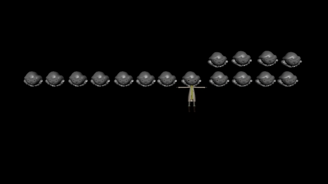
Figure 1.1 – Shown above, the first version of the animatic which had been presented on Tuesday 21st February.

Figure 1.2 – Shown above, some still images extracted from the animatic, that was created by Jess Campbell and Tyrone Owens.

Featured above is the link to the animatic and some imagery that was extracted from the piece. The two-dimensional drawings were created as part of a collaborative effort between Jess and Tyrone, with the additional assistance of Ryan for editing and completed render. Katie and myself were less involved with the creation of the illustrations for the animatic but did contribute to the discussion when we worked as a group to reduce the duration of the interview to a shorter period.

As the animatic was a responsive piece to an interview, there was very little feedback that specifically addressed the animatic, meaning that no suggestion could be offered that would lead to drastic visual changes regarding our vision. Often by this stage in the ideation and preproduction process narration and story development are key to progressing forward with the animated piece, but as the animated documentary is an account from Attracta, Jess’ grandmother, that creative hurdle had been removed from the pipeline.

The majority of the team were only viewing the animatic at the same time as the rest of our peers, and as Ryan felt that he had to roughly edit the piece together hours before the presentation, we decided to use Tuesday afternoon as an opportunity to go through the animatic together and provide feedback on what we felt was successful, and what areas needed improvement.

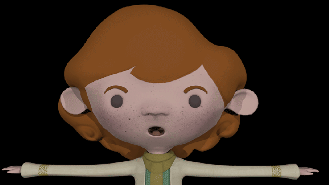
Figure 1.3 – Shown above, the revised version of the animatic, with feedback implemented and an illustrated ending created.

The second version of the animatic, featured above, implements some of the feedback that we received from the tutors and peers, in addition to the suggestions that we made between ourselves as a group. The relevant topic was addressed in greater detail here.

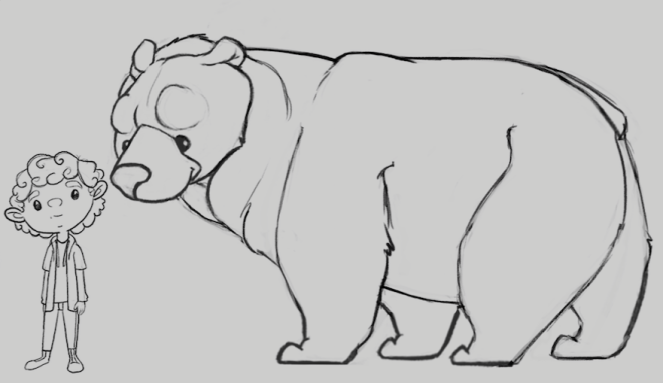
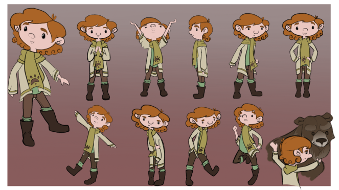
Whilst Tyrone and Jess were delegated to creating the illustrations for the animatic, the rest of the team were given their own areas to focus on. Ryan focused his attention on a range of different tasks, such as a texture test (located here), and an emotion graph that was created in response to the peaks and dips of the interview (located here). Katie focused their attention towards the development of the dog design, and talks about their process in greater detail here. In addition to the animatic, Jess also worked on look development – which can be viewed here, and here.

During the past two weeks, I have been focusing solely on the environment design. For a short period after the last presentation, the team had yet to process through the interview footage and narrow the focus – as a result, the locations were unfinalised. Rather than wait ideally for a specified period when the entire team could convene in order to do this, I used some of the footage that Ryan and Jess captured from their time at Newcastle to create some painting tests. This process is discussed further here.

 With the edit to the interview audio, the team were able to define each location that was necessary for the story to be told. I have listed each environment in greater detail within this post. In total, this resulted in six different scenes – with cosmetic changes occurring within that space to allude to the progression of time. Whilst painted concepts of the environment will come at a later date, the immediate focus was to create initial greyscale sketches to capsulate a sense of composition, lighting, and which assets are required within each scene.

img_3263

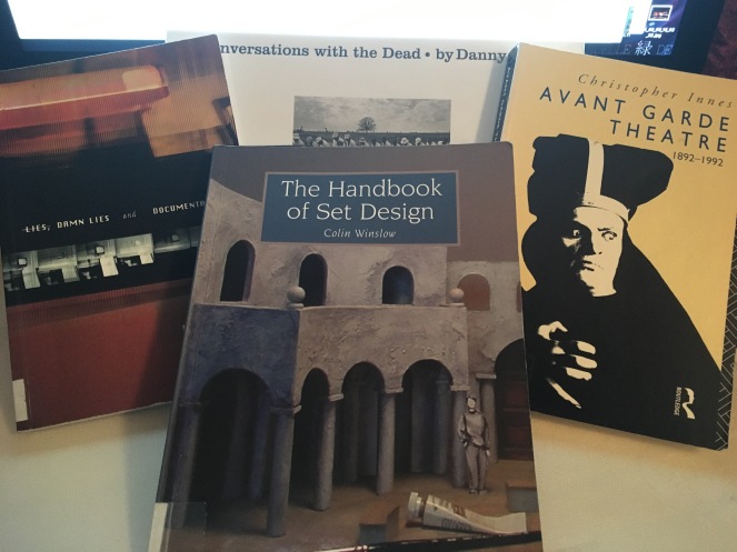
Figure 1.4 – Shown above, the books that I have recently rented from the Ulster Library.

In addition to the illustrative design work that I have been producing, the library has become a good source of methodology to gain better insight into areas which I had mentioned in the pitch presentation post, addressing theatre design and animated documentaries specifically. The books in question are featured above in figure four. Unfortunately, I have not had an opportunity to explore the text as in-depth as I would have liked, but the material will continue to be relevant throughout the duration of the project. I am exploring the potential of conducting research podcasts as it is a format of media that I recreationally enjoy to listen to, and receive that through the verbal explanation of my research, the relevance towards the project tasks will be more coherent.

I have recently purchased a book that was recommended by members at polycount.com as a staple purchase for an aspiring environment modeller. The book in question is called, Maya Studio Projects: Game Environments and Props. Unfortunately, it shall be a few days yet before it arrives, but I am looking forward reviewing the material contained within.

In addition to gathering research through the traditional methodology of books, I have been investigating artists already working within the industry whom I find to be inspiring. It should be known that the influence behind my decision to focus primarily on environment design was a result of studying the work being created by Matt Rhodes and the rest of the art department for Dragon Age: Inquisition, and in fact, the Art of Dragon Age: Inquisition is one of my favourite books in my reference library.

Within the past few weeks, Charlie Maxwell has approached myself and Katie with a proposition of creating some vector imagery of her animal character, Cerberus, as part of an approach to acquire art assets for merchandising opportunities. After she had received feedback on her project during the week that her primary focus should be targetted towards nailing the execution of the script, it became apparent that the project’s vision was a lot denser than what one person may have been able to manage. When it was discovered that she had wanted Katie and I to focus solely on her animal character rather than creating pieces for each featured character within the show, I identified an opportunity to help out my classmate. I approached Charlie with the offer of assisting her with the environmental design of her piece, promising to create a few sketches, with the potential to complete a rendered concept piece – if the time was available between work for my own team project. I detail my conversation with her in this post.

The team have received some positive feedback, and from the reactions of the tutors, appear to be right on schedule with our progress. The work created within the next two weeks will be paramount for the smoothness of the production stage, but having an established plan will be vital for achieving the bi-monthly submission deadlines.

Management Plan


Team Roles and Responsibilities: 

Ryan – Production Director: editing the audio and implementing changes within the animatic.

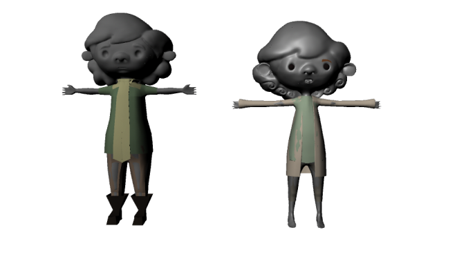
Jess – Art Director: developing the aesthetic look within a three-dimensional style.

Tyrone – Lead Animator: experimenting with animation techniques in order to achieve a dynamic approach to the dog character’s movement.

Katie – Character Designer: continue to design the dog, and build the three-dimensional model for both the adult and the pup version of Zara.

Nadine (me) – Environment Artist: finalise the environment concepts and organise the asset requirements for each individual scene within the animated documentary.

Bi-Monthly Deadlines:

6th February – Pitch Project

Process Stage: Completed. Review link can be accessed here.

20th February –  Presentation One: Research, Animatic & Plan.

Process Stage: Completed. The team presented on Tuesday the 21st of February, and have begun to adjust amendments based in relation to feedback from tutors, classmates and other team members.

6th March – Presentation Two: Final Design, Updated Animatic, Tests & Updated Plan.

Process Stage: In-Progress. The team has their delegated roles in each area of the pre-production process. We shall spend the next two weeks focusing on nailing down the elements that we need in order to be prepared for the production stages.

27th March – Presentation Three: Animation, Render Tests, and Production Update.

Process Stage: To be Completed. 

3rd April – Presentation Four: Rough Animation, Render Tests implemented within the Animatic, and updated Production Plan.

Process Stage: To be Completed. 

24th April – Presentation Five: Research, Animatic and Production Plan.

Process Stage: To be Completed. 

15th May – Presentation Six: The Final Deadline – Fully-Rendered Animatic.

Process Stage: To be Completed. 

As the responsibilities are delegated to fully utilise the benefit of having a five-member group, the team should be able to achieve these deadlines as long as progress continues with the same pace and passion that has been demonstrated so far. In my personal opinion, I am very content with how the animated documentary is progressing right now and am relieved that we have managed to avoid certain elements within the pre-production process that, in the past, have caused a delay in the progress. This semester has a lot more promise, and I hope that the team will be able to achieve that target.

Post Directory


Artistic Ambition

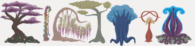
Figure 1.5 – Shown above, the tonal studies that have been created so far for the environment ‘look’.

Environment Foundations – sketching out rough designs for team feedback, and implementing their preferences within environments that have an approach of dictated ambiguity. At which point, the pieces are developed into tonal renders – enabling the task of creating an asset list that is required for each scene.

The Environment Foundations

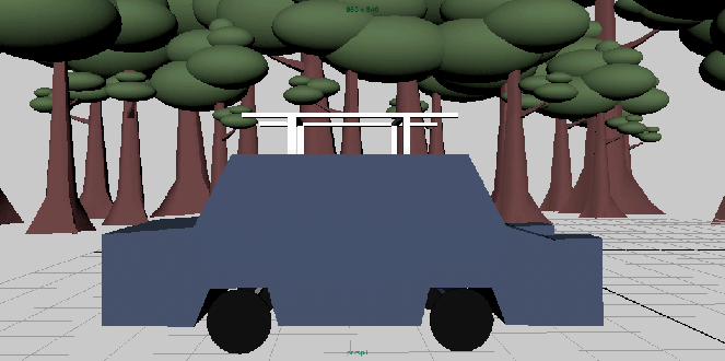
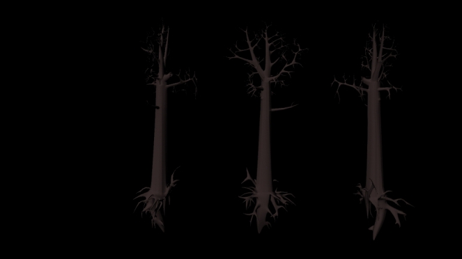
Figure 1.6 – Shown above, the environment paint studies that I created whilst we waited for confirmation of animation locations.

Environment Paintings – Exploring the aesthetic look of the animatic. Creating painting studies of environments captured during Jess and Ryan’s time in Newcastle, acquired on the day that the interview was conducted. The locations in question are Newcastle beach, and a river setting within Tollymore Forest Park.

Environment Painting Tests

Research Potential 

Library Sources – books featured within figure four. The books in question are ‘Lies, Damn Lies and Documentaries‘ (2000) by Brain Winston, ‘Avant-Garde Theatre‘ (1993) by Christopher Innes, ‘The Handbook of Set Design‘ (2006) by Colin Winslow, and ‘Conversations with the Dead‘ (2015) by Danny Lyon.

Further Sources – ‘Maya Studio Projects: Game Environments and Props’ by Micheal McKinley. This book came recommended by members of the Polycount.com community network for any inspiring environment artists. Whilst expensive, even for a secondhand book, I hope that the information contained within will be a fantastic resource that will strengthen my comprehension in environment design. I look forward to it arriving within the next few days.

Technical 

tee_alpha_animated

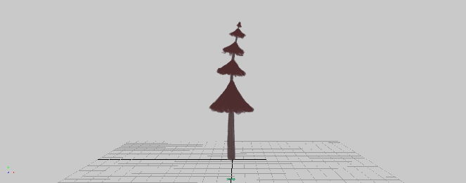
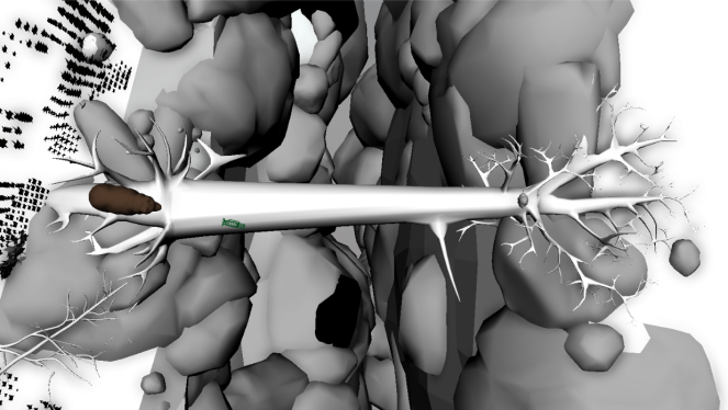
Figure 1.7 – Shown above, the bend deformer that I applied to a quick tree painting that I created. 

Atmospheric Test – Two-Dimensional Planes in a Three-Dimensional Environment. This was an attempt at creating an element that evoked atmospheric design that was subtle, yet had an impact on the tone and mood of the scene. The test was heavily inspired by the work of Mikael Gustafsson. However, it was conducted using a blend deformer in Autodesk Maya, rather than Gustaffsson’s software of choice – Unity.

For reference on how to create this result, I consulted with a tutorial that I sourced from Youtube, located here.


Biblography: 

Cortes, S. (2012). Maya Bend Deformer. Available at: https://youtu.be/fbNauQs4P2U [Accessed 22 Apr. 2017].

Innes, C. (1993). Avant Garde Theatre. 1st ed. 11 New Fetter Lane, London EC4P 4EE: Butler & Tanner Ltd.

polycount. (2011). An Environment Artist reading list (actual books (made from trees)). [online] Available at: http://polycount.com/discussion/91999/an-environment-artist-reading-list-actual-books-made-from-trees [Accessed 20 Feb. 2017].

Lyon, D. and McCune, B. (2015). Conversations with the dead. 2nd ed. Regent’s Wharf, All Saints Street, London, N1 9PA: Phaidon Press Limited.

McKinley, M. (2010). Maya Studio Projects. 1st ed. New York, NY: John Wiley & Sons.

Rhodes, M. (n.d.). An Interview with Matt Rhodes, Lead Concept Artist at Bioware.

Richardson, M. (2014). The art of Dragon Age Inquisition. 1st ed. 10956 SE Main Street,milwaukie, OR 97222: Dark Horse Books.

Winslow, C. (2006). The handbook of set design. 1st ed. Ramsbury, Marlborough, Wiltshire: Crowood Press.

Winston, B. (2006). Lies, damn lies and documentaries. 1st ed. London: BFI Pub.

Major Project · Semester Two

Environment Transition Tests

scene_transition_test_gif

(1.1 Shown Above – A blocked out demonstration of a transition test for the animated documentary.)

As part of the preparations for the pitch presentation tomorrow, the team discussed creating some storyboards and tests to demonstrate the vision of the environment techniques that we intend to utilise for transitions between scenes in the animated documentary.

Jess had been delegated the role of producing some illustrative storyboards, whereas I offered to create a blocked out three-dimensional environment that would enable us to test the possibility of using the camera movement and scene positioning to create an example of the intended transition techniques.

The process was rather uncomplicated – I created the rough environment within an hour, and was supplied with a dog rig by Tyrone to substitute for an animal character as the scene was composed. The most challenging aspect of creating the test was animating the camera so that it retained a steady swoop whilst being rotated on a fixed pivotal axis.

Whilst it is not an aesthetically appealing example of the transitional approach, it serves the purpose of describing the motion as a visual aid. In my opinion, the test was an opportunity to clarify the approach with the rest of the team, as well as demonstrate it during the pitch. Admittedly, the team ran into complications during the week as a result of communicational issues – it resulted in some team members being unable to understand the approach that Ryan and Jess were describing. The issue was resolved somewhat with Jess’ compositing test, supported by additional examples that were provided later by  Ryan, referencing a piece that had been previously viewed during our second year – For the Remainder (David, 2012).

Upon reviewing those examples, the process of visualising the transitions became much more coherent. Through the process of creating the test animation, it is my opinion that the rest of the team now have a unified comprehension of the approach, now that it has been applied in a nature that is relevant to the subject matter. It shall be interesting to see where further tests shall bring us now that the first test has been completed – there are a lot of unique ambitions with regards to the construction and transition of the environments to evolve around Zara, so it can be presumed that testing will continue to occur until we can confidently confirm that the ambitions are feasible for execution.

(1.2 Shown Above – Some sceenshots of blocked out models created for the transition test. The dog character has been outsourced by Tyrone Owens.) 


Reference:

David, O. (2012). For the Remainder. Available at: https://vimeo.com/36818561 [Accessed 9 Feb. 2017].

Creative Futures

Animating

boy_jump_down

(E.1 – Shown above, an earlier version of the animation which features in the final animation video, linked here)

Unfortunately, animating was one of the areas within the production that had been extremely pushed for time, especially when I suddenly became the role of management for the extra hands that had been brought on to assist with the project. My time that had been dedicated to working on animating the clearing scene was drastically impacted, which was a hapless consequence of the events that have surrounded this project within recent weeks.

The small shot that is shown in example one is all that I was able to achieve – I would have enjoyed the experience of pushing it further, but could not because of time constraints. The version that is featured within this blog post varies slightly from the piece that was included within the final render, but I felt that the movement of the boy jumping had been negatively impacted during the importation stage and therefore wished to feature it as a separate post.

The significant challenge of this animation was that it was two characters with some form of interaction. In my previous animation attempts, there was only one singular character that often did not have to do a perfunctory motion with another person or object. The fact that the boy is sliding from the bear’s back, and that he is moving and gesturing his head towards something in the distance, made the experience of animating the sequence unique.

Undertaking the animation task was a bit daunting, as it has been roughly around two years since I have had to animate characters. To refresh myself of the process, I referred to a book that I had in my personal library, Animation: A Handy Guide, by Sheila Graber. Reviewing the book enabled me to refresh my memories very promptly, which due to the time constraints was beneficial for production. However, there were certain elements such as the autokey feature and the graph editor which I rediscovered in the midst of the animation process.

Evaluating my work, I would assess that my timing still requires a lot of practice – but the animation has promise, which after a two-year hiatus really surprised me. Personally, I found that once I was animating and the frustrations of forgetting small details had passed, that I was actually enjoying the task. It is a shame that the circumstances prevented us from achieving more, and if other technical problems had not arisen, it would have been satisfying to see all of the commitment and hard work that I had performed during the creation of the boy be explored further through movement and expression.

Whilst my technical abilities have not developed much from this process of production, I have regained them – that is something that I feel is vital to have for the second semester. By identifying my weakest area of the animating process – timing – this will enable me to specify what I should research further, and practice, in order to improve my technical skill.


Reference:

Graber, S. (2009). Animation. 1st ed. London: A. & C. Black.

Creative Futures

Mastering Blend Shapes

One of the elements of production I had not expected to find myself dealing with was the blend shapes for the boy character, as this had been a job that was expected to be completed alongside the rigging task that Scott had offered to complete. Indeed, there had been some lovely facial movement occurring on the rig that gave the boy some intense expressions that would work lovely within the animatic short.

However, mere days before the deadline the rig was subject to a revision to correct some controller, geometry and weight issues that had been identified during the animation stage. I am still unsure what may have happened during the revision stage, but when the boy was returned to the team those blend shapes that existed previously had disappeared entirely.

I was in contact with Scott immediately once this was discovered, but he was unable to shine some light on the situation. I enquired if it would be possible to simply import existing blend shape bases into the scene in order to recreate them, but he was unable to guarantee if that would be successful or not. Knowing that Scott was under his own immense pressure as the deadline approached, I made the decision to try to identify the problem and do what I could to correct the issue.

Provided that I have never done any facial animation before, creating facial expressions in order for that to be completed was an interesting experience.I referred to a lot of tutorials (located here) as part of my research before beginning the task, so that I could have a comprehensive understanding of the technical process that was required in order to produce blend shapes.

blendshape_render

(E.1 – Shown above, the blend shape head manipulation sources)

The process was not as difficult as I had perceived it to be. Granted, in total it had taken me three attempts to manage to successfully have my original head stay in position and have the adjustment heads influence the vertices on that, rather than disconnecting from the boy’s body to transition towards the target head – that had made me want to tear my hair out in frustration. However, I was aware that every time that I was required to restart the process, the faster my workflow increased. The technical ability to create blend shapes had improved from zero to acceptable, enabling me to create expressions for the boy that I personally would deem okay. The feedback from the rest of the team was generally positive too, which was also reassuring.

Some of the areas in which I struggled during the blend shape production were around the eyes and eyebrows, due to the inability to create symmetrical changes to both sides of the face. The minor manipulations that had been created using that tool created issues for the animators, as the blend shape did not work if the head was tilted downwards – front facing, however, still continued to function as expected.

I really developed an understanding of how to use additional features within the Maya tools to help the expressions come to fruition – soft select, in particular, was very efficient in adjusting the placement of vertices in small sections. Whilst there were periods that I had to turn soft select off and manually move singular vertex at a time, soft select allowed me to create the general shape of the expression as a base to work towards. The sculpting tools – specifically the smoothing tool – corrected some of the deformation and shadows that had appeared as a result of drastic geometry manipulation.

The eyebrows were also challenging – creating the blend shapes for one side of the face had been a breeze – the difficulty was trying to match the same deformation on the other side also. Whilst there may have been a proficient way of doing so, I was unable to locate a tutorial that provided any insight into doing this task with a different approach. Therefore, I used my intuition to judge the deformation by eye, hoping that I could make them appear symmetrical enough that it would not be obvious to the casual viewer that they were not entirely matching.

blender

(E.2 – Shown above, a render of the blend shapes that were created for the boy’s facial expressions) 

The difficult situation with the blend shape creation was that there was very little hours that could be spared in order to create them. If the situation had of occurred a few weeks previously, I feel that the additional time that would have been available would have enabled me to research some character facial expression sheets and build quite a dynamic range of expressions and facial movements. However, despite the restrictions that were in place, I believe that I was able to create a sufficient amount of expressions to communicate the emotion and reactions of the boy.

 My technical ability to create blend shapes developed from the requirement to fix a significant issue in a short period of time. Whilst I feel that there is still a significant amount of research to conduct in order to prepare blend shapes that would facilitate greater facial deformation and lip syncing, the first attempt at creating expressions for a character model appears to have been successful.

Creative Futures

Minor Design Work

During the semester, I had a minor role in other areas of production such as pre-vis conceptualisation and three-dimensional modelling. Unfortunately, as most of my time had been consumed by the creation of the boy model, I had less time to explore any of these concepts further than what is shown below but from what little I could create, it was an enjoyable experience.

The Log Bridge

screen-shot-2017-01-20-at-08-52-36

(E.1 – Shown above, the tree within the forest environment at the cliff edge) 

Modelling the log bridge was an unexpected task, which was given to me between the completion of the character model, but before it had returned from being rigged. During that period, I was tasked with creating the bridge – a key asset in the climax of the forest scene.

Rachel provided me with a mood board for the visual style she had intended for the log bridge, which included specific types of trees and examples of trunks and roots that could be used as part of our concept. The fallen tree had to fit in with the environment, which was difficult as the forest was primarily filled by skinner birch style trees. I feel that this perhaps had been an oversight by Rachel, who had forgotten that the environment needed trees which would look natural amongst the rest of the area, and yet be believed that this tree was to have fallen by its own accord.

In order to be functional within the scene, the design required that the tree is wide enough for both characters to be able to cross, and for it to look like it had fallen – unlike the base model we had been using, which looked freshly cut down by a lumberjack.

Example two shows the tree in greater detail. Admittedly, this had been a disappointment. I had really wanted to explore some element of environment design as this is where my interests are targetted towards for specialisation. However, being asked to produce a tree within a matter of hours that had the complexity of branches and roots, and without prior ability to practice working out the most efficient way of creating such a model, resulted in work that was not the best quality that I should have been able to create.

The tree seemed to be of an acceptable standard, and so it was imported within the scene as shown in example one. It is not the most aesthetically pleasing piece of work, but looking at it from a positive perspective – it was suitable for the task, and when faced with a time crunch, that is the top priority.

tree

(E.2 – Shown above, a turnaround of the tree with a brown lambert applied)

Environment Design

tree_assets_clean

(E. 3 – Shown above, my environmental design concepts) 

I had really enjoyed spending time working on the concept designs for the trees in the environment. As the forest had fantasy elements, I wanted to diverge away from what was expected and explore unique and unusual designs.

What I enjoyed exploring the most was twisting the perception of trees that already exist and pushing the design towards a range of unusual colours. It was challenging to experiment with the form of the tree to create something quite different, whilst still maintaining an element of childlike awe – throughout the design process, I reminded myself to think like a child, so I imagined the trees as obstacles that I would like to climb in, or in which to have a tree house that would be my sanctuary den.

Ultimately, the team decided that the best way to approach the forest would be by creating realistic trees, and communicate the fantastical element through the choice of colour rather than the entire design. I was disappointed, admittedly, but I supported the unanimous decision of my fellow team mates.


The Therapist Body Shape

screen-shot-2016-11-14-at-13-03-55

(E.4 – Shown above, the therapist body silhouettes) 

These rather roughly drawn together body silhouettes were created during a time in the production schedule that the character of the therapist continued to be asked, yet some within the team did not want to discuss the matter further – in case they then were given the obligation of creating her.

At one point, I had gotten frustrated with that attitude, taking a break from the process of creating the boy model to sketch up a small range of body shapes for the therapist. My impression was that if at least a visual silhouette could be chosen, that would be a stepping stone towards character progress. The types ranged from athletic to curvy, and the majority of the team seemed to be drawn towards the plumper silhouettes, as they felt that the body type conveyed friendliness and approachability.

Katie eventually stepped up to undertake the task of creating the therapist. I had expressed concerns that because I was inexperienced with character modelling and that given my attempt at the boy had taken the duration of nearly three weeks to get to the finishing stage (and at the time – still required UV mapping and textures), I may have been unable to create her within the time window that we had available to do so. The choice was pragmatic, as this was during the time that the team began to feel the strain of the social situation that was steadily increasing the workload for the three of us. I felt that it was a very mature decision for them, and appreciate the stress that they elevated from the rest of the team by undertaking that task.

Bear Designs

(E.5 – Shown above, the bear designs) 

Above are the bear concepts that I had explored earlier in the semester before Katie had been assigned the role of that character design. It was during this period that I discovered just how much I sucked at drawing bears. Whilst I can see that the continued practice helped my designs implement some logic to the shape and appearance, they still were not very aesthetically pleasing.

Katie recommended the Aaron Blaise tutorial to me, and while I did refer to the guide when creating the bears shown in example four, I feel that by trying to get a stylised appearance I compromised the anatomy of the animal – hence why they look so poor. In this situation, I failed to find the balance between anatomically correct proportions and the caricature of the animal, making it unrecognisable as a bear. Despite the disappointing result, I am relieved to know where it was that I had gone wrong so that I know how to avoid and/or correct that situation in future.

The Logo Design

bear_and_boy_title_with_texture

(E. 6 – Shown above, the boy and the bear logo design)

One element that identified the animation lacked was a logo or introductory text for the beginning of the animation. Whilst winding down one evening, I decided to create an image that incorporated different elements of the project together to create a logo. The colour scheme was inspired by the mural piece that Katie had created for the wall in the therapy room, whilst the trees represent the forest environment that Rachel created. Finally, the bear paw print is a direct replica of the one that I had hand painted onto the tail of the boy’s scarf. In a sense, the logo is a representation of the work that we have created collaboratively during this project.

Completing these minor design elements for other areas of the project provided me with a break when I began to experience frustration during the modelling stages of the boy creation. The change of pace allowed me to return to my main challenge with fresh eyes, and a new focus. During that difficult period, I felt that it was exactly what was required to motivate me to progress forwards towards the best outcome that I could achieve.

In certain areas, my input was implemented. I was disappointed that this was not within the area that I held my interest towards, but that is the nature of production. The designs were not the right choice at the time, but that will not be the case every time – and that is what I must focus on when I begin to feel disheartened.

Creative Futures

Topology, Texturing and UV Mapping

Whilst Scott was constructing the rig for the boy, the next stage for production was unwrapping the UVs in order to create textures – another challenge that I had yet to tackle during my experience at university to date.

However, before textures could be created, the primary objective was to first create a clean topology layout for the boy’s head. As he had been sculpted in Z-Brush Core and the base of his body deleted once the clothing geometry had been created, his head was the main focus of concern. The head mesh contained a high poly count, which would have significantly slowed down both the importation and rendering processes in the later stages of production.

There was another significant reason for the reduction in topology for the head, and that was facial rigging. With such a dense mesh, it would be extremely difficult for Scott to produce any blend shapes for the character expression. Therefore, it was vital that I produced something with significantly less poly-count, and that the topology around the features such as eyes and mouth had a cohesive construction that could be manipulated in order to mimic the movement of facial muscles.

Before re-topologising with the use of the modelling kit, I began by using the Z-Brush re-mesh tool within the sculpting programme in order to significantly reduce the poly-count to a moderate number. The intention was that the hair mesh would be left untouched, whereas the face would undergo a full topology overhaul. Once that had been completed, I reimported the mesh into Maya to begin the process.

thumb_img_2040_1024
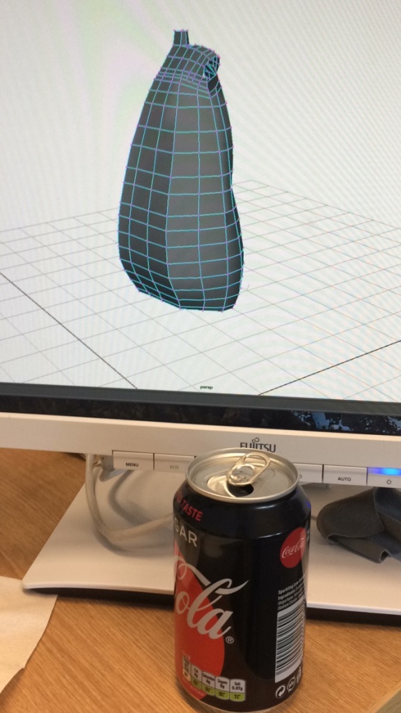
(E.1 – Shown above, the process of retopology whilst following an online tutorial) 

Shown above in example one is a photograph that I had taken during the retopology stages within Maya, using one of the tools from the modelling toolkit to manually place each individual quad upon the surface of the mesh. The process was time-consuming, as expected with such a laborious task. However, following the tutorial (featured here) was very beneficial as it provided me with the knowledge to place quads in particular patterns in order for the mesh to be manipulated into expressions during the blend shape creation.

Once the head was completed, it was passed along to Scott so that the focus could then be directed towards creating UV maps for the entire boy model, in order to paint textures. Again, this is a process that was entirely new to me, and as such, I had to enquire with my team members in order to investigate the most efficient way to carry out such a task. Katie directed me towards an easy to follow tutorial that proved to be the most efficient way to improve my comprehension of the technical approach.

I began with the clothing, as the basic shape of the material was the kindest way to ease into the task. Once I gained familiarity with the process, my speed increased and the mapping was occurring within an efficient time frame. During my experience, I found that the socks and the head provided the most challenges due to the folds of the material, and the volume of the boy’s hair – through trial and error, I was able to use the layout and stitching features to eventually create a clean and cohesive UV map. The issue of seams did occur during the process, especially on areas of the mesh that were not clothing such as the head and hands, but through logical exploration,  I was able to locate areas on the mesh that would conceal the seam quite proficiently.

(E.2 – Shown above, the UV completed maps for the boy model) 

Once the mapping was completed, the next stage was painting the textures for the boy. The process was a mixture of hand painted with some texture manipulation for the garments of clothing, to create an impression of differentiating materials. The skin and hair textures were entirely hand painted, with intricate details such as a rose tint to the cheeks and nose, and the freckles on the boy’s face.

(E.3 – Shown above, the material textures that were gathered to be used as overlays. References included below)

When placed together in a grid style layout, the earthy colour scheme really becomes apparent – true to the conceptual designs that were created for the boy. The textures that were sourced from online were edited in such a way that they would suggest subtle detail to the clothing material, without looking out of place when combined with the purely painted textures of the skin and hair.

(E.4 – Shown above, the painted textures that feature on the boy model) 

Included below is a turnaround of the boy model with the textures applied to the mesh. I am delighted with the finished result and feel that the outcome has retained the true aesthetic appeal that was evident in the two-dimensional drawing. My technical intellect has increased significantly during this stage of the process, as I now have the knowledge to unwrap a model from scratch manually – without the assistance of a plug-in or additional feature. I was able to incorporate my existing skills with photoshop in order to paint the textures by hand, with the additional option of using sourced images to give the clothing a textured appearance. The team and I are very pleased with the outcome of the model, and are looking forward to seeing how he will appear in the final renders once he has been rigged and animated.

boy_turn_360

(E.5 – Shown above, a turnaround for the boy featuring the textures) 


Reference:

96-2446-83563_z. (n.d.). [image] Available at: https://www.wallcovering-wallpaper.com/416656-1156-Eanes-Beige-Fabric-Weave-Texture [Accessed 15 Dec. 2015].

easttextilesClassic. (n.d.). [image] Available at: http://simoncooke.co.nz/easttextiles/pics/easttextilesClassic.jpg [Accessed 15 Dec. 2016].

HAB-2. (n.d.). [image] Available at: http://d1dlocfje6a34f.cloudfront.net/currentimages/shop/images/Style_Guide/colours/large/HAB-2.jpg [Accessed 15 Dec. 2016].

kntiq1. (n.d.). [image] Available at: http://www.myfreetextures.com/wp-content/uploads/2011/06/kntiq1.jpg [Accessed 15 Dec. 2016].

rubber_texture1320. (n.d.). [image] Available at: http://bgfons.com/upload/rubber_texture1320.jpg [Accessed 15 Dec. 2016].

Creative Futures

Modelling the Boy Character

One of the biggest challenges that I have been presented with this semester has been the task of creating the boy model for the animation.

I returned to university this semester to increase my abilities in environmental design and modelling, so admittedly being given the responsibility was not ideally my first choice. However, as Rachel was the person on the team with the most 3D experience during her experience at Donkey Crew for placement, it was thought to be of benefit to the entire team if she were to create the environment.

Previous attempts at character modelling have never been successful for me, and as a result, I felt the additional pressure of creating something so vital to the core of the project. The boy is the protagonist of the piece – the story is a tale of events which happen to him, and he features in both settings within the animation. To summarise, nearly every single shot would be likely to feature the boy in some form. No problem, right?

(E. 1 – Shown above, the last character modelling attempts)

To include context at just how poor my prior experiences with character modelling have been, I have included two examples which are shown above. The image on the left was supposed to be the image of a  fly, whilst the image on the right was supposed to be a ladybird insect. Despite the fact that these models appear to have been created within a short interval, what you are viewing was the outcome from hours of struggling and frustration. From the second semester of our first year, I have never again attempted to model a character as my confidence had really taken a knock during that period.

Understandably, I was experiencing a lot of fear at the thought of being unable to produce something of decent standard yet again. The team was relying on me to achieve this task, as we had such a substantial amount of work to do between now and the deadline in January. Whilst it was still late October, I was aware that time had to be permitted for me to understand how to create a character model that was both true to the concept, and most importantly, functional.

At first, I was eased into the task by first creating a block shape model that could be used as a size reference, both against the bear and as a marker within the environments. In a sad admission, I do have to explain that the fact that the block out of the boy resembling a somewhat human form felt like a major achievement at the time.

(E. 2 – Shown above, is block out model of the boy. Also featured is the bear block out that Katie created) 

Once the block out had been created, it was time to proceed towards creating the real model. My first attempt was unpromising, and as you can see from the image featured below, my workflow was self-destructive. I was focusing on creating shape too early, rather than prioritising anatomy and shape of the boy character – this resulted in a very poor attempt at creating the torso. Apparently, my subconscious discovered this fact too as the file seems to have been deleted from my computer.

unadjustednonraw_thumb_7dc5

(E. 3 – Shown above, the first attempt at modelling the boy character)

Admittedly, it was around this time that university work skidded towards a sudden stop, as my sister gave birth an entire month premature. Due to the commitments at home, I was honest with my team about how I would be unable to proceed much further for the next few days as my time required gathering items for my nephew, and factoring in daily hospital visits.

In retrospect, I feel that the time apart from the project brought some clarity regarding my workflow to create the boy model. Whilst I had been diligently reviewing tutorials (featured here), trying to imitate their workflow was not successful for me. Therefore, I adjusted my focus to examine their steps rather than repeating them so that I could understand the purpose behind the decisions being made, and make that applicable within my own process.

(E. 4 – Shown above, from left to right – the process that I made creating the base model in Autodesk Maya) 

The process ran a lot more smoothly during my second attempt modelling the boy. Shown above is the stages that the boy went through during the blocking out period. Admittedly, my lack of skill in character modelling made the intention of replicating the original concept of the boy within a three-dimensional form to be very challenging. As the concept of the boy had been posed, I created front-facing and side body silhouettes to use as a guide during the blocking stages.

(E.5 – Shown above, the body silhouettes that were used during the blocking stages)

However, upon reviewing my process using the silhouette guides, I discovered that I had strayed away from the original intention of the team – the discussion was that the boy and the bear would be polar opposites in terms of design. The boy is small, skinny with an oversized head, whilst the bear is large, chunky and with a more realistically proportioned anatomy. The third model that is shown in example four (E.4) illustrates how reliant I had become upon my reference during the modelling process. If the original design had been conceptualised as a larger child than this would have been fine. However, this outcome was not true to the character design, and therefore, I sought a new method to correct that issue.

screen-shot-2017-01-19-at-02-48-29

(E.6 – Shown above, the boy (drawn by myself) shown with the bear (drawn by Katie) for a scale and proportion reference) 

The solution was accompanied by a new challenge – being thrown in at the deep end by learning entirely new software. Whilst Autodesk Mudbox had been suggested to me because as a relative to Maya, one would expect that it would be easier to navigate, I elected to explore Z-Brush Core. During the summer, Katie and I decided to split the money between us to purchase a single use license so that we could experiment with 3D sculpting in preparation for returning to

During the summer, Katie and I decided to split the money between us to purchase a single use license so that we could experiment with 3D sculpting in preparation for returning to university for final year. Unfortunately, the circumstances that had occurred during my summer prevented me from acquiring time to do so, but I was determined that I would find the time to learn as sculpting felt to be more artistically friendly than modelling within Maya.

Personally, Z-Brush appeared to be the most efficient way for me to correct the proportional mistakes that I had created during the blocking out process. In example four, there is evidence of my attempt to block out the shape of the hair to create the necessary volume that was aesthetically endearing within the conceptual designs. The size of the hair and the complexity of the tight ringlet curls would be incredibly challenging to create using only Maya software.  Therefore, it felt that the most appro

Therefore, it felt that the most appropriate choice would be to tackle the new software, as the technical tools provided within that software package would enable me to replicate the conceptual design of the hair, transforming it from a two-dimensional imagery to a three-dimensional reality.

The risk in learning new software is finding the time to perfect it. Whilst I felt that I was being innovative by using software that I had no prior experience with, yet could evaluate that it would be the most efficient way for me to achieve the conceptual design, it did slow down production speed significantly. However, the decision was made after weighing each option – to continue in Maya, and only achieve a somewhat successful replication, or to explore a new software package that, with practice and experience, would enable the team to have a true-to-form model of the boy.

(E.7 – Shown above, the result of the boy once he had been resculpted using Z-Brush Core)

To learn more about sculpting techniques and workflows, I watched process and tutorial videos, which are featured here within my research post. Learning by example aided my ability to pick up skills quite quickly, and through the process of trial and error – within a week and a half, I had managed to achieve the result which is shown above as example seven. Z-Brush Core was not the easiest of software to contend with, and during the sculpting stages I had to visit the Apple store quite frequently as some of the hot keys were inter coding with my Bamboo graphics tablet, meaning that my computer had to be reset manually by the geniuses – this resulted in more time set-back, which was frustrating as my own lack of proficient speed was costing the team enough production scheduling with the calculated risk of utilising new software.

It was near the end of the sculpting period when I ended up in a conversation about Scott Gill regarding the peer work process and evaluation stage, during which I expressed my concerns over the ability to rig the boy character. I had confided in him that I have had no previous experience with rigging and that whilst there are assistance packages such as Advanced Skeleton that would enable me to construct one efficiently, I had yet to find the time to research thoroughly into those services.

Scott kindly offered to create a rig for the boy, as he expressed that he would like to gain some more experience as it is something that he would like to specialise in. The team agreed that Scott creating the rig would ease some of the pressures that we were experiencing regarding the production schedule, and would greatly benefit using that time to work on other production elements. The next week and a half had been spent collaborating with Scott on the next stage of the modelling production: the clothing.

boy_outfit_perspective

(E. 8 – Shown above, the boy outfit in various different poses) 

In order to understand what it was that I was trying to create with the boy’s outfit, I felt that it would be appropriate to first sit and work out the garment from various different angles to explore how the design would work as a three-dimensional concept. The boy appears to a few years older than intended within these designs, but the priority of the task was focused on the outfit itself – perhaps applying these poses to blank models would have been the more appropriate choice, as that issue does deter concentration from the main objective.

boy_vs_boy

(E.9 – Shown above, clothing practice with an older, and more recent version of the boy model) 

During the periods that I had been left without my laptop computer due to it being repaired in the Apple store, I spent the time experimenting with character clothing. I began by fleshing out general shapes on an older, chunkier version of the model before exploring with delicate, lighter fabrics and materials on the more recent model. Once I had completed my character base sculpt in Z-Brush, the next stage of production was creating the outfit.

Scott explained the best way to optimise the boy model in order for him to rig it, which was to use the clothing as the body of the boy, rather than have an underlying mesh beneath the garments of clothing. He showed me an example of a model he had worked on during his time with Enter Yes (formally known as Black North) which really helped me to understand exactly what it was that he required.

The model was reimported into Maya (see example seven) before clothing was modelled around the existing shape. The clothing was modelled in stages, using the base shape of the body as a proportion guide. I had investigated the potential of creating fabric clothing within Z-Brush, but it required skillsets to be higher than novice level in order to create believable material. Therefore, reverting back to Maya for the finishing steps seemed to be the most suitable approach for my technical abilities and knowledge.

The process was time-consuming, similar to that of the rest of the previous stages. Clothing within Maya creates a unique property of challenges – the most significant is making block geometry and manipulating the mesh until the outcome somewhat resembles a fabric material.  The most challenging areas were the parts of the outfit that had creases – the scarf and the socks. The material was constructed slowly, with a lot of intricate placement of vertices in order to create an aesthetically appealing shape. Matching the scarf tail to the snood geometry was a very intricate process, whereas the socks were manipulated with soft select to achieve a hastily pulled up piece of fabric, emerging from below the cuff of the boot.

Once the clothing had been completed, the final stage was deleting the body mesh from underneath the garments, and to model hands facing flat rather than in a rotated position, which I had done initially. The hands were a difficult piece of geometry to construct – our design had realistic digits. Therefore, modelling four fingers and a thumb that had to be small in order to appear childlike took a few hours, and two attempts in total.

(E.10 – Shown above, the first and second attempt at modelling the hands) 

Once completed, the boy was given one last review from the team before being presented to Scott in order for the rig to be constructed. He was delighted with the way that it had been created, which had been pleasant feedback to receive.

boy_turnaround_notexture

(E.11 – Shown above, a turnaround of the completed boy model) 

To summarise my thoughts about creating the model, I would have to express that I found it to be the most challenging task that I have undertaken so far within my university career. The process really pushed me out from my comfort zone and forced me to face my fears over my poorly developed skills regarding three-dimensional software to achieve the goal of creating our boy model for the team.

I feel that my technical intellect has benefitted from the process significantly. Whilst my process was slow and hindered from external events occurring in my personal life during the time of production, I am still astonished at just how quickly my skills seemed to have developed within such a short time frame. I was able to use my intuition to research and investigate which software packages would enable me to achieve the intended appearance of the conceptual design as a three-dimensional model, before taking a risk of learning that software within a short interval in order to successfully produce that outcome.

The process has enabled me to become more innovative within my working methods, as I have been able to integrate different software within my processes in order to become more proficient, that has enabled me produce an accurate replication of the original design, including the aesthetic choices such as the petite body and tight ringlets. The biggest hurdle that I faced during this procedure was speed – whilst learning the new software sanctioned the knowledge of sculpting and design to be implemented within modelling, the time that it cost the production schedule was rather significant. In future, I hope that the knowledge that I have gained from this experience will provide useful for increasing the speed of my workflow and that with continued practice, it shall lead to the production of a higher quality result.